As we saw more and more users continue to connect using their phones, the decision was made to investigate how an app could deliver students a better experience of the SJS service. Feedback was telling us the user experience of the Student Job Search website was poor, especially on mobile.
Because there are approximately four times as many student users than employer users, and both user types requires a different account, the app would focus exclusively on students.
Research
Our first question was to see if anyone actually wanted an app. Anecdotally there was some desire but we needed to know for sure. I constructed a short survey to learn about the audience and begin to determine what features students would want and what pain points we should fix. We combined this with analysis of our web traffic to see what type of devices students were using to browse the site.
Notable feedback
- “I would use student job search way more often if there was an app. It's quicker and easier!”
Students expressed a strong preference for an app and had some clear features requirements, interestingly there was only one serious concern about an SJS app.
Pains points for students
We knew the UX was poor when using the SJS website on a mobile device, many pages were not optimised for small screens and the touch interface was often difficult. The other significant issue was that Navigating search results is unintuitive, behaviour when browsing through jobs is unpredictable and users often lose progress when switching between lists of jobs and individual job descriptions. On top of those, the overall performance can be very slow.
Notable Feedback
- “It’s difficult to see all the information on the mobile site. I don’t find it very functional and end up leaving the site as it is not appealing to be on”
- “Website is often Slow loading”
- “Website is often Slow loading”
Features
Once we mapped out the pages for all the student functions, it became apparent that it was not a particularly complex workflow, we decided the app should replicate everything a student could do. We also integrated improvements that we had already identified over the web UX was lacking.
Notable features requested by students
- Allow certain functions to work offline.
- Better guidance through tasks and feedback on errors.
- “I feel like an app would be good to search jobs but unsure of whether I would actually apply through the app. Would be more likely to go back to my laptop [to make an application]”
- Better guidance through tasks and feedback on errors.
- “I feel like an app would be good to search jobs but unsure of whether I would actually apply through the app. Would be more likely to go back to my laptop [to make an application]”
Prototyping and validation
Blank pages were not clear for new users.
Initially we testing with existing students who had been using the website in the past and had prior account activity. When we tested with a groups of new users, pages like application history appearing blank confused them. We added a holder message to the watchlist, application and saved search pages to indicate to users what would appear here.
Users struggled with the watchlist button.
It wasn’t visually clear enough what the state changes were and users kept pressing the button. We added an onscreen message and made the state changes more obvious. Onscreen messages were added for other actions as well.
Users only wanted to see their active applications.
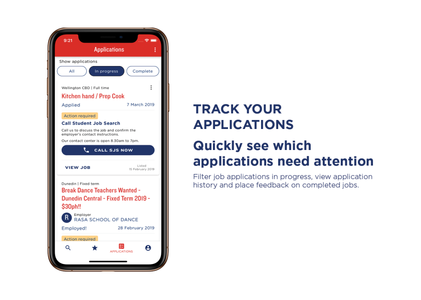
Tabs on the My Applications page were rearranged to default to showing just in progress jobs.
Users wanted to be able to find their SJS number easily.
The SJS number (needed when speaking to SJS staff over the phone as part of some job applications) was moved from the bottom to the top of the profile page.
Many users tried to tap on the job title to view the whole job listing.
This was made into a link.
Users were missing the instructions of what to do after they had completed their application.
Applying for a job is a multi step process and often there is another step after the application. This section was emphasised to make sure users would see it and know to take any further actions required.
Final design
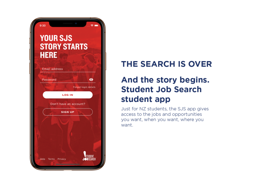
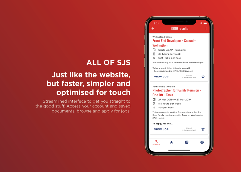
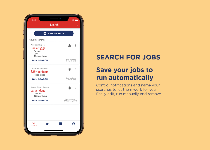
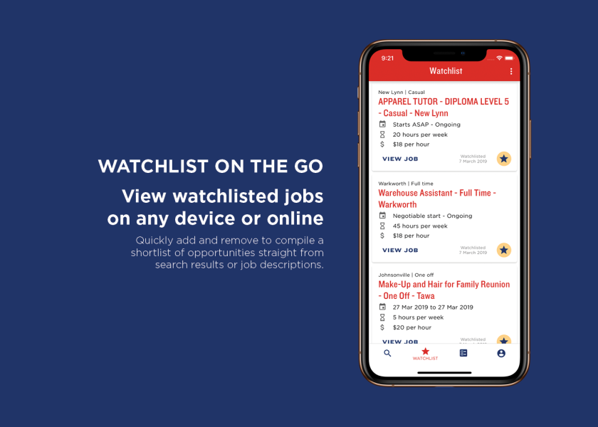
Results and learnings
The app was initially envisaged as just an additional access channel to the student functions of SJS. Improvements to the user experience have been very well received, reports that come in through the bug reporting feature are largely feature requests. As the project progressed we got feedback that users wanted extra features that built on the core functions the website offered. Offline access to previous applications and jobs watchlist has been well received and is a feature that can only be offered by the app.
Notable stats
- Within 6 months of launch, 50% of student traffic to SJS is via the app.
- Over 10000 downloads across the app and play stores
- Consistently in the Top 10 job apps in NZ
- Over 10000 downloads across the app and play stores
- Consistently in the Top 10 job apps in NZ
Team
Me (Alex) - Designer - Research, prototypes, wireframes, UI, style, UX testing
Jovan - Developer - React native, design feedback
William - Tester - Functional testing, device testing